NDL brand design
I led a full redesign of NDL’s brand, redefining its visual identity and rolling it out consistently across every touchpoint. This included transforming social media, the website, paid campaigns, brochures, and all printed materials to align under a more cohesive and elevated brand system. I also redesigned the packaging to strengthen shelf presence and better communicate the brand’s positioning, and developed a unified approach for activations within the pharmacy channel. As the brand expanded into new markets such as Dubai, I adapted the identity to ensure it remained consistent while resonating locally. Throughout the process, I led the creative direction end-to-end, establishing a clear and scalable brand language across all platforms.
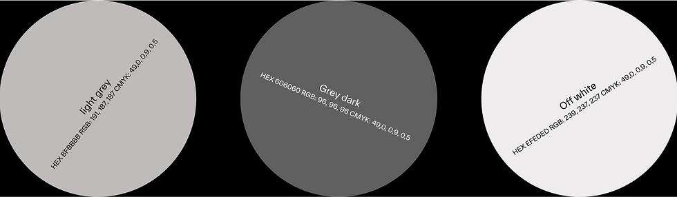
Typographic System & Color Palette
The NDL typographic system is built around TWK Everett, a contemporary sans-serif that balances precision with warmth, offering a clean and confident voice across all touchpoints. Its subtle character details bring a modern, refined feel while maintaining high legibility. The color palette is intentionally restrained, centered on off-white paired with light and dark greys, creating a neutral, timeless foundation. This minimal approach reinforces clarity, sophistication, and a science-driven aesthetic, allowing content and product to take focus.

AI-crafted product visuals, professionally retouched in Photoshop.


Custom-designed stickers created to complement the product identity.

Website
The NDL Pro Health website brings the brand to life in a clean, performance-driven space designed to inspire discovery and simplify the path to purchase. Developed in collaboration with Rafa Nadal and Cantabria Labs, the platform combines real-life imagery, product demonstrations, and clear benefit-led messaging, alongside customer trust signals and scientific credibility, to give users a complete view of this advanced supplementation range while enabling a fast, intuitive route to explore and buy.

AI-crafted product visuals, professionally retouched in Photoshop.


Above: Launch teaser for social — part of a launch package Little Troop created for Instagram.


